In-depth introduction to flexbox
Modern CSS is loaded with features; many things that in the past required JavaScript and tooling now can be done with plain CSS. If I were to recommend one feature that is worth learning in detail, it would be flexbox. With the flexbox, you can build most of the layouts that you can think of. Element positioning and sizing is much simpler. Even dreaded horizontal alignment is not a big deal. It really saves a lot of time. In cases where flexbox is not enough, there is also display: gird. The bonus of learning flexbox in depth is that alignment specification for flexbox is also used for the grid, so learning grid afterwards is a breeze. The article is long and may feel dry at moments but bear with me. You won't regret it. At the end of the article, I offer a few simple examples where flexbox makes life much easier.
Flexbox positions elements within flex container across one axis (called the main axis). By default, this axis goes horizontally from left to right. To create a flex container set display: flex on the element. Every item inside the flex container becomes a flex item. The axis perpendicular to the main axis is called the cross axis.
<div style="display: flex">
    <div>
        1
    </div>
    <div>
        2
    </div>
</div>
You can change the direction of the main and cross axis by setting flex-direction property on the flex container. Possible values are: row (default), column, row-reversed, column-reversed. In most examples, I'll be working with row. The reversed variants are sometimes useful but for the purpose of this article we will stick to the row.
<div style="display: flex; flex-direction: column;">
    <div>
        1
    </div>
    <div>
        2
    </div>
    <div>
        3
    </div>
</div>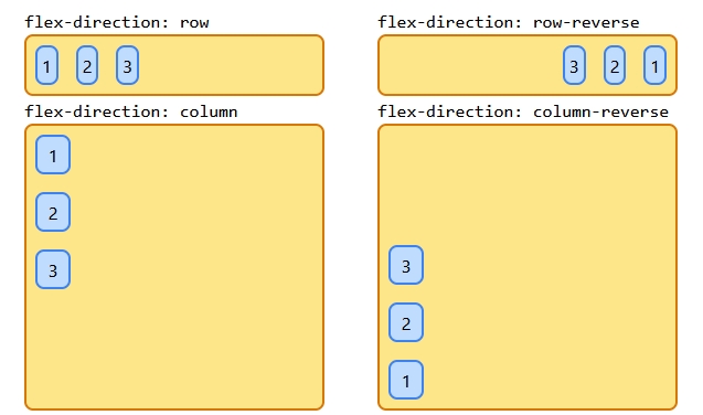
Flexbox, by default, will allow items to take as much space as they need, given, of course, the container is big enough. We change it by setting flex-basis on the flex items. This property sets preferred size across the main axis. This is the size that will be set if there is no need to grow or shrink items.
<div style="display: flex">
    <div style="flex-basis: 120px;">
        1
    </div>
    <div style="flex-basis: 120px;">
        2
    </div>
</div>
Since we work with the default setting for the main axis (row), in our case flex-basis is influencing the width of the items. For flex-direction: column it will influence the height of the items.
If we want to get this nice responsive experience where items just fit inside a container no matter the size of the container, we have to instruct the flexbox how it can manipulate items. flex-grow property set on flex item will allow it to grow if there is space available. See the following example.
<div style="display: flex">
    <div style="flex-basis: 120px; flex-grow: 1">
        1 (width: 175px)
    </div>
    <div style="flex-basis: 120px; flex-grow: 4">
        2 (width: 340px)
    </div>
</div>
The value of flex-grow is a number. Flexbox will get flex-grow values from all items and grow them proportionally to their values. In the example, the first item has flex-grow: 1 and the second item has flex-grow: 4. The first item grew 55 pixels (from 120 set in flex-basis) and the second item grew 220 pixels (4*55).
You don't have to set flex-grow for all items. A good example is a site header containing a menu on the left and a user avatar on the right. Instead of setting float on divs and horizontal alignment through elaborate margins and padding, you can use flexbox (I'll show you how to easily accomplish reliable horizontal alignment later ).
<div style="display: flex">
    <div style="flex-grow: 1">
        1 (menu)
    </div>
    <div style="flex-basis: 120px">
        2 (avatar)
    </div>
</div>
flex-grow works only if there is spare space in the container. What if items flex-basis add up to a bigger number than the space across the main axis? Flexbox will shrink all items in equal proportion to fit items in the container. We can manipulate proportions by setting flex-shrink on the items.
<div style="display: flex">
    <div style="flex-basis: 400px; flex-shrink: 1">
        1
    </div>
    <div style="flex-basis: 400px; flex-shrink: 4">
        2
    </div>
</div>
As you can see, it works analogously to flex-grow. The second element has been shrunken proportionally more than the first one. The best workflow is to start with the smallest acceptable container and work out behaviour for bigger containers using flex-grow and other properties.
There is another option for dealing with situations where there is not enough space on the main axis. We can allow flexbox to wrap content. Set flex-wrap: wrap on the container.
<div style="display: flex; flex-wrap: wrap">
    <div style="flex-basis: 400px">
        1
    </div>
    <div style="flex-basis: 400px">
        2
    </div>
</div>
Flexbox still works along one axis here it just wraps axis around to the next row.
Main axis alignment
So far in all examples, we were manipulating flex items sizes. Some times we want our times to have a defined size no matter how big the container is and we want to justify them inside the container. For that cases flexbox allows us to manipulate/distribute remaining space in different ways. For that purpose, we have justify-content property that we can set on a flex container. Possible values for this property are: flex-start, flex-end, center, space-between, space-around, space-evenly. See the below examples.
<div style="display: flex; justify-content: center;">
    <div style="flex-basis: 120px">
        1
    </div>
    <div style="flex-basis: 60px">
        2
    </div>
    <div style="flex-basis: 120px">
        3
    </div>
</div>
justify-content is good enough if our items have exactly the same height (for rows) or width (for columns). If items have different dimensions on the cross-axis the outline will be ragged.
If it is not what we want we can manipulate alignment on the cross-axis using align-items property on the flex container. Possible values are: flex-start, flex-end, center, baseline, stretch. For baseline and stretch to work you can't set cross-axis dimension on items. The dimensions must come from the content inside the item.
<div style="display: flex; align-items: center;">
    <div style="flex-basis: 120px; height: 40px">
        1
    </div>
    <div style="flex-basis: 120px; height: 120px">
        2
    </div>
    <div style="flex-basis: 120px; height: 60px">
        3
    </div>
    <div style="flex-basis: 120px; height: 100px">
        4
    </div>
</div>
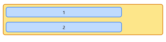
This is quite useful and powerful. Remember the example with the header containing the menu and avatar? If you use floats and margin/padding to align them; it is enough that someone changes menu height and you have to go and fix alignment on the avatar. Using flex you can position item horizontally and vertically no matter what size items have.
<div style="display: flex; align-items: center;">
    <div style="flex-grow: 1; height: 80px;">
        1 (menu)
    </div>
    <div style="flex-basis: 120px; height: 40px;">
        2 (avatar)
    </div>
</div>
Cross axis alignment
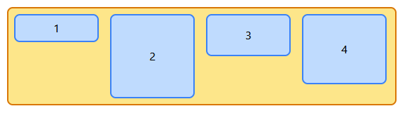
There is one more area where we can run into alignment issues; it is when we allow flexbox to wrap content and container is bigger than what is needed on cross axis. To position items in multi row/column container, we use align-content property set on the flex container. The possible values for this property are: flex-start, flex-end, center, space-between, space-around, space-evenly.
<div style="display: flex; flex-wrap: wrap; height: 250px;  align-content: center">
    <div style="flex-basis: 60px;">
        1
    </div>
    <div style="flex-basis: 60px;">
        2
    </div>
    <div style="flex-basis: 80px;">
        3
    </div>
    <div style="flex-basis: 80px;">
        4
    </div>
    <div style="flex-basis: 40px;">
        5
    </div>
    <div style="flex-basis: 70px;">
        6
    </div>
    <div style="flex-basis: 40px;">
        7
    </div>
    <div style="flex-basis: 140px;">
        8
    </div>
</div>
App layouts
Flexbox is perfect for building layouts. Say, you build an app where you need a header, footer, side panel and main area. The header and footer have constant height and take all horizontal space. The sidebar has a constant width and takes available vertical space. The main area takes the remaining horizontal and vertical space. Something like this:

You can decompose this layout into two parts. First flex column (header, sidebar with main area and footer are flex items here). Sidebar and main area form a flex row.
<div style="
    display: flex;
    flex-direction: column;
    width: 100vw;
    height: 100vh;
">
    <div id="header" class="box blue"
        style="
            flex-basis: 64px;
        "></div>
    <div id="middle-wrapper"
        style="
            display: flex;
            flex-grow: 1;
        ">
        <div id="sidebar" class="box green"
            style="
                flex-basis: 200px;
            "></div>
        <div id="main" class="box yellow"
            style="
                flex-grow: 1
            "></div>
    </div>
    <div id="footer" class="box blue"
        style="
            flex-basis: 64px;
        "></div>
</div>
Positioning initials within avatar
The goal here is to center horizontally and vertically users initials withing avatar badge.

<div style="
display: flex;
justify-content: center;
align-items: center;
width: 64px;
height: 64px;
border-radius: 100%;
font-size: 24px;
" class="blue box">
SB
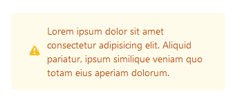
</div>Center icon and multi-line text
For this example I’m omitting irrelevant styling.
<div class="...">
    <div style="
        display: flex;
        align-items: center;
    ">
        <svg style="
            flex-shrink: 0;
            " class="..." viewBox="0 0 20 20"
            fill="currentColor" aria-hidden="true">
            <path fill-rule="evenodd"
                d="M8.257 3.099c.765-1.36 2.722-1.36 3.486 0l5.58 9.92c.75 1.334-.213 2.98-1.742 2.98H4.42c-1.53 0-2.493-1.646-1.743-2.98l5.58-9.92zM11 13a1 1 0 11-2 0 1 1 0 012 0zm-1-8a1 1 0 00-1 1v3a1 1 0 002 0V6a1 1 0 00-1-1z"
                clip-rule="evenodd" />
        </svg>
        <p class="...0">
            Lorem ipsum dolor sit amet consectetur adipisicing elit. Aliquid pariatur, ipsum similique veniam
            quo totam eius aperiam dolorum.
        </p>
    </div>
</div>